For my magazine to be suitable for my target audience I had to interpret some conventions from other real magazines into my own, so that it looked realistic and professional so that I could effectively attract my target audience. Below is the link to a Prezi presentation I created discussing my product and it's conventions:
AS Media Evaluation on Prezi


In which way does your media product represent particular social groups?


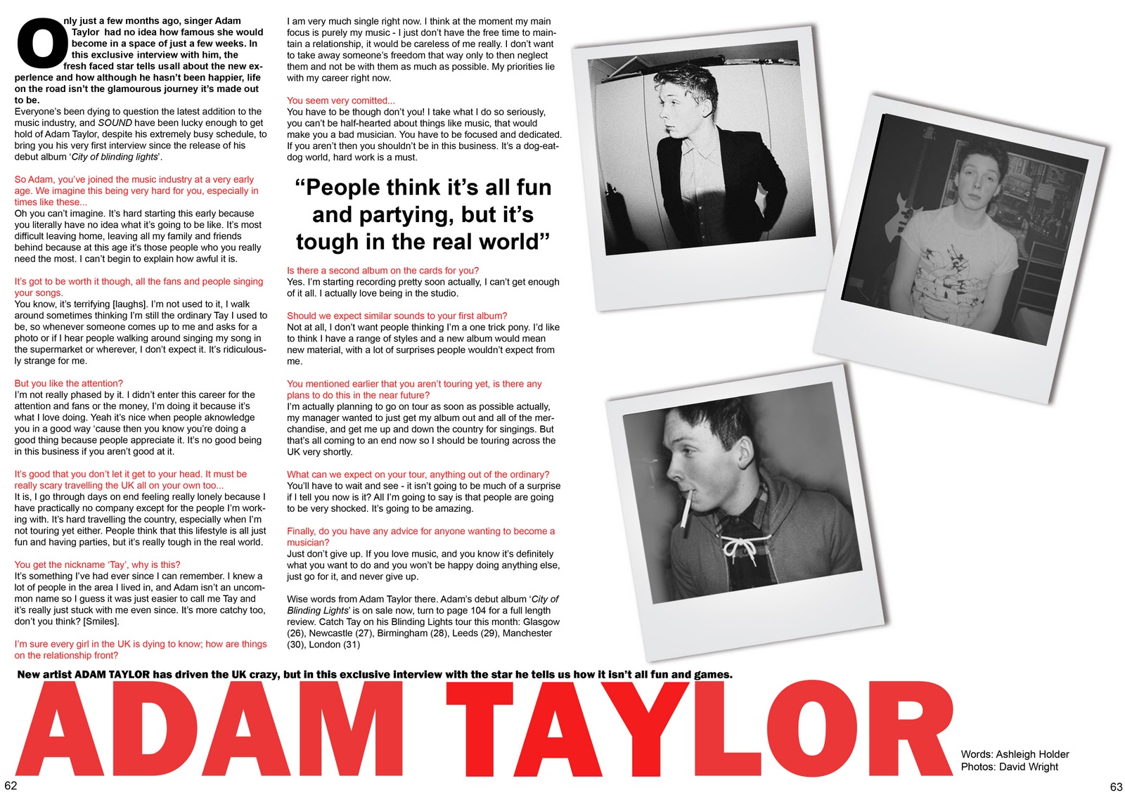
I have compared the main person within my magazine with a character on the cover of a published magazine that is distributed by the company that would distribute my magazine, to show how I have represented a particular social group. I have used Bob Dylan on the cover of the magazine Mojo, who creates music of the rock/indie/folk genre which is similar to the artist in my magazine.
In both of the images the body language and posture are very similar. It's a very laid back position that looks relaxed. Both characters are making eye contact with the camera and the shot is a medium close up with a head on shot. Both males are wearing low-key clothes in neutral colours that don't massively stand out, which matches in with the toned down scheme of the cover. Hair styles are also similar as they are both styled in a messy way. All of these factors help portray the indie genre of my magazine as they all compliment each other and blend in with the theme. A difference in the two images is the background - the published magazine's background is a plain simple block colour, whereas mine is a rather complex image consisting of typical London landmarks. Regardless of this factor both images consist of the same tone and have the same feeling about them. There is also the fact my own image is in black and white whereas Bob Dylan is in colour. They are both scaled down images yet the colour difference shows how diverse the genre can be, how there is a wide breadth of things you can do within this genre to portray it to the indie/rock/folk social group.
Like Bob Dylan, I wanted my character to hold similar values. I wanted to portray the fact that no matter your age, gender or style, if you work hard enough and want something so much you can achieve your dreams. Bob Dylan started making music at 18, and the genre he produces is widely loved but also criticised. My character is also young and looks fresh and in order, which presents a positive image to my target social group.
What media institution would distribute your media product and why?
I have created a video on Animoto demonstrating which media company would distribute my media product and why.
I have carried out some research on distribution and how magazine media products could be distributed or shown to a wider range of audiences. Below is a Prezi presentation demonstrating several different factors:
Distribution on Prezi


Who would be the target audience for your magazine?
To ensure that my magazine would appeal to my target audience I carried out some research on their lifestyle and what they are interested in so that my magazine would be suitable for them.
I created a simple online questionnaire for my peers, which was filled in by teenagers aged 15-20 which is my target audience but very accurate. This questionnaire consisted of five different questions to find out what my audience were interested in doing, what their preferred genre of music was and what their lifestyle situation was like. My questionnaire and a sample of results are summarised below:
Summary of a sample of results:
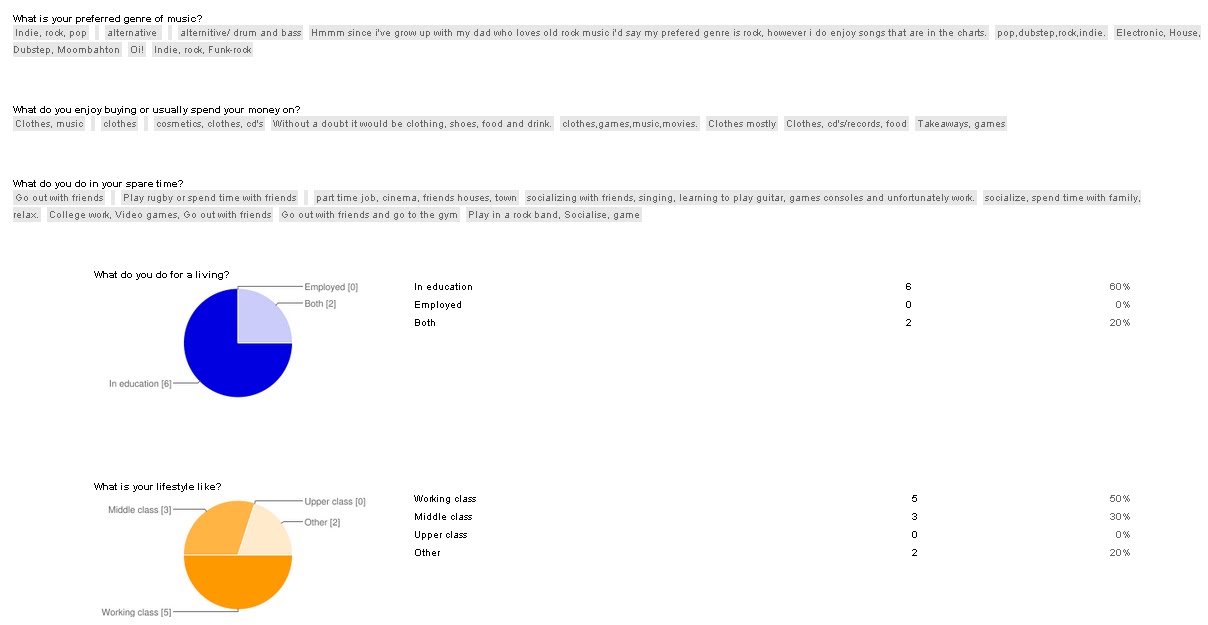
My target audience was mainly working class. with all of the participants being in education with some also being in work. This means that my magazine would be affordable to a wide range of people who could even buy their own magazines regularly. The dominant response for what people do in their spare time was that they like socialising with friends, with them spending money on clothes. The genre of music that occured most often was indie and rock, so I know I need to create my magazine aimed towards these people.
I then constructed a simple survey to gain feedback which consisted of ten questions to see what my target audience were like, i.e. their gender and age, what their lifestyle was like, and what they thought about my magazine and if they would buy it. Below is a sample of questionnaires that were completed and what answers I received:


The people who said they would buy my magazine were dominantly of a younger age group, with all of them being in education. There was a range of both male and female peers ho the majority of bought magazines monthly. Almost all of my audience said they usually listen to indie music which shows this is the kind of music I should include in my own magazine. The price range they would buy magazines at tended to be of the lower or middle price range. Improvements I received were to mainly add more elements and to fill the space, so I know what I needed to change and who I was catering to.
How did you attract/address your audience?
After carrying out research to find out who my target audience were, I was able to incorporate what their interests and likes into my magazine so that it would appeal to them. Below shows how I have done this:
What have you learnt about new technologies and software, from the process of constructing your magazine?

Photoshop CS5, Prezi, Blogger, Animoto.
Here I have created an image on Photoshop showing all the digital equipment and software that I used. This includes Photoshop CS5 to create my media product, as well as three websites used to help with my research and planning.
To design, create and edit my three music magazine pages I used the well known editing programme Photoshop CS5 as I felt it would be the best software for editing and it's range of tools. I had also used the programme before slightly so I knew the basics which helped me and knew what techniques were available to me. It also allowed me to learn more of a variety of complex editing tools and how to use different layers and grouping techniques to assist me.
To present my research, planning and product, I used the blog website blogger.com. I had not previously used this website however I did have experience with different blogging websites so the concept was not new to me so it was easy to get used to regardless of the fact I had not used it before. It was a very productive helpful method to display my work as it meant everything was in one place and together, as well as in order. It was easy to add new posts and to also find previously added posts if I felt the need to edit any and they were displayed in a simple layout. It is an easier method rather than having everything in a file and separate. It allowed to to document every stage and all my research I found along the way, even if they were only small additions/alterations. I learnt how to insert different types of media such as images and videos, as well as links and elements I could embed. This was helpful as it allowed me to display a range of media elements to make my blog look more interesting and diverse so that I could show that I can use different mediums to show my work.
Other websites I chose to use were Prezi and Animoto. These allowed me to produce online interactive presentations and short videos to talk about different aspects of my evaluation of my final product. It helped display a range of elements in my evaluation so that it made it look more interesting and friendly instead of endless amounts of plain text. Users can also interact more with this range of media as it requires the audience to physically click and listen. As well as these four products, I used Google Documents which meant I could create questionnaires to gain audience feedback and so I could also find out who my target audience were. It allowed me to receive a different audience from those who would fill in my survey.
In which way do you feel you have progressed from the preliminary task up to your final product?
From my preliminary task to my final product, I feel I have progressed a great deal in several areas. Firstly, I have gained a wider knowledge of the editing software that I used. I have learned how to successfully crop, cut out and edit images in Photoshop, as well as a range of other editing techniques such as the magnetic lasso tool and text settings. This meant that images as well as other elements on my product looked more professional and integrated together well, so that the quality was of a higher standard, in comparison to my preliminary task which was very bare, plain and boring. It didn't look professional or organised although it had basic generic conventions. Fonts had progressed to look more in setting with the tone of a magazine and looked of a higher standard compared to the simplistic fonts in my preliminary task. I gained a further understanding of construction and how the standard of how a product looks depends on how you put all the separate elements together. This helped me to develop my skills and create an overall better final product. I used a better colour scheme which kept in tone with my product and went well together as my preliminary task consisted on two separate colours which looked uninteresting and not appealing to audiences. The layout of my final product also improved as it needed to be conventional and realistic, so it would look in place amongst real media products. Overall I have progressed massively, as there has been a vast improvement in the standard of my work from my first preliminary task to my final product.