
This is the first draft of my front cover for my music magazine. I am quite happy with how it looks so far however there are some adjustments which could be made to make it look more professional, however I feel it does look quite like an actual magazine you could buy. For my main masthead, I have used a very simple font which I feel is effective as it is consistent with the theme and genre of the magazine with it's simple but bold effect. To influence the audience to buy the magazine I have included a sell line at the top of the magazine which says "Britain's No.1 music magazine", which is effective as it shows how popular the magazine is which influences the more people to purchase the magazine. Finally, for the sell lines for the articles, I have tried to include a range of different topics to attract a wider audience, such as two interviews on two different artists, top 50 artist and upcoming gigs. I have done this as different people may be interested in different aspects of magazines.

This is the first draft of my contents page for my music magazine. I think that out of the three pages I have created this is my worst, as it looks rather unprofessional and there is a lot of white space. I have included a main masthead which is the magazine name, and the title 'contents' with the date. The main masthead is the same colour as the front cover so it is consistent and looks more professional so the audience can recognize it. For my article headings I have chosen a small range so that it is more appealing so wider audience may want to read it.
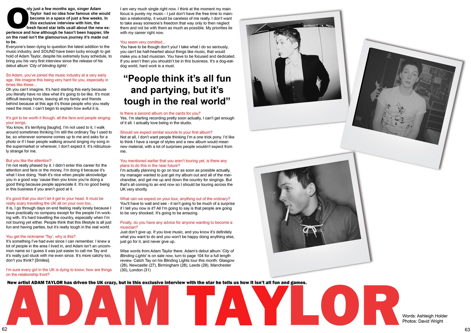
This is the first draft of the double page spread of my music magazine. I feel very happy with the way this has turned out as I think that it looks quite professional and interesting - the columns of text are conventional however the photographs are done in a way which is unusual and different. However, I think that there is a lot of white space which could be filled to make it look more interesting and less bare. I have used a range of questions which are in colour to differentiate between the answer and itself. I have also inserted a pull quote to make it look more realistic and I have also used a paragraph to introduce the article to make it seem more official and informative.
No comments:
Post a Comment